Property Intelligence UX · Design and validation planning · September 2026
Design stage · not yet builtDesigning for the decision, not the dataset
A county export can contain a great deal of data without answering the question a person actually has. A homeowner wants to know whether to request an assessment review. An analyst wants to identify a case worth working. A data operator needs to know whether a load is complete enough to publish. The challenge was serving those decisions without letting missing information look like certainty.
The product work
I developed seven journey and service-blueprint maps and six proposed screens, including future-use concepts that remain outside the current build. Each map connects one user's job to the information, actions, and supporting process needed at that step — not just what the county's data happens to contain.
Jobs to be done, not features
Every screen is scoped against a single job statement before any layout gets drawn — a plain verb, a concrete object, and a quiet contextual clarifier, scored against an internal JTBD framework rather than a feature wishlist. Two examples, unedited from the design pack:
"Check whether my county value looks out of line and what an appeal could change, as a range I understand, before I decide."
"Pick the parcels worth an analyst's time this season by their evidence components, not a single rank."
The screen flow
Six screens, in the order a parcel actually moves through them. Each carries its own honest build status — nothing here is presented as further along than it is.
Homeowner result
A savings range with a plain reason for its width, not a single number sold as certain.
Prototype onlyAnalyst queue
Cases ranked by evidence components, not one opaque score.
CSV export firstParcel evidence
Every fact tagged with its certainty state before a person acts on it.
Ready to extendField plays
An outreach action the data can honestly support, gated until every guardrail clears.
Static preview firstLoad report
Whether a data load is complete enough to call current — reconciled files, zeroed gates, nothing missing unlisted.
Report, not an appUniformity monitor
Where assessment uniformity looks weak for a study window, with sample sizes shown so nobody reads it as a finding.
Blocked on a partnerWhat it looks like
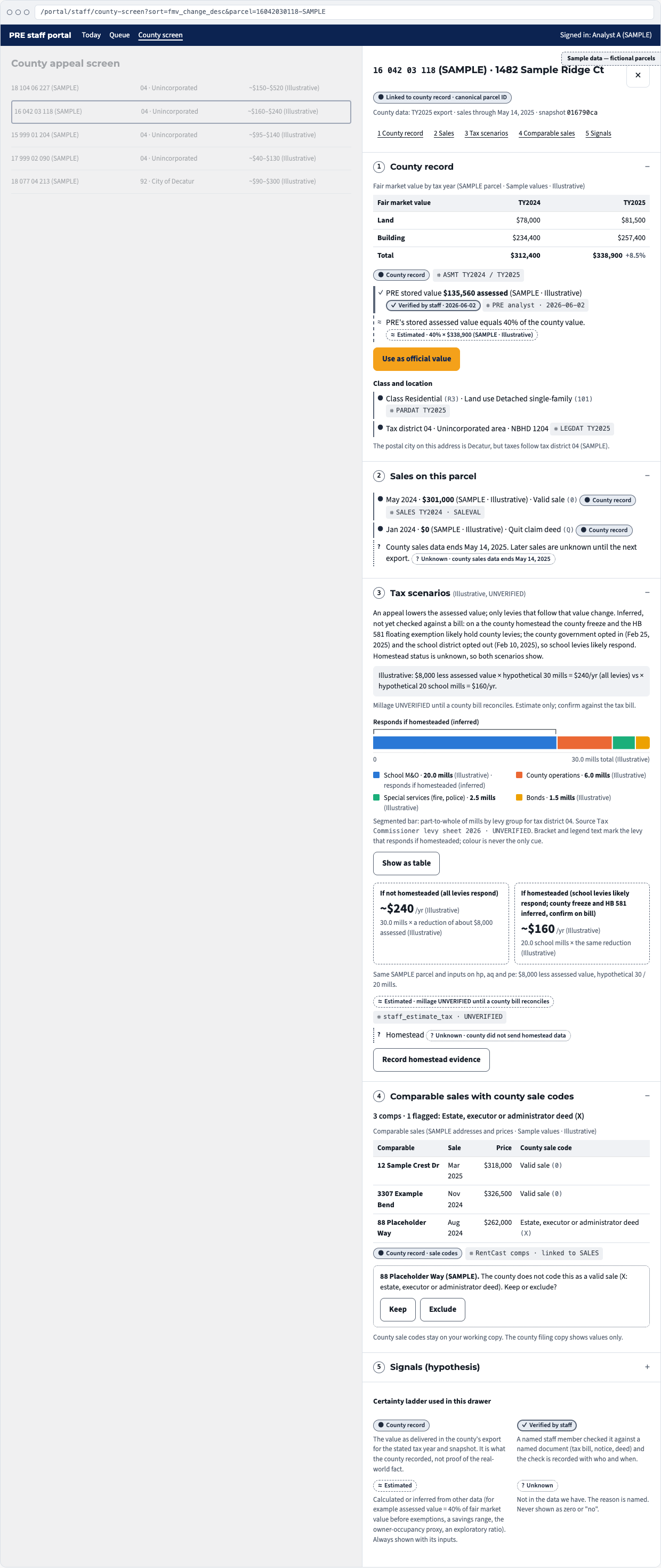
Real screens from the design pack, at full detail — every parcel, address and dollar figure is sample data on a fictional property to start with, and the county name is additionally redacted here to match this page's policy on client-identifying detail.

Four evidence states
Every value on screen carries a label for where it came from, so a gap in the data is never presented as an answer. Each state's visual weight fades with its certainty — solid, solid, dashed, dotted — so the distinction still reads in grayscale or under a screen reader, not by color alone. The design specifies that Unknown must never be silently displayed as zero or no.
The county supplied the value — not proof someone independently verified the real-world fact.
A person checked this specific value against the underlying record.
Modeled from available data, shown as a range where a single figure would be misleading.
Not silently shown as zero or no — the gap itself is the information.
Design principles, and the rule each one produces
Twelve principles govern the pack; each one is written down next to the concrete interface rule it forces, so a principle can't stay a slogan.
- Plain language first.Financial mechanics open with a three-sentence explanation and one worked example, before any table or chart appears.
- Honest uncertainty, everywhere.The same four-state ladder, icon plus text, never color alone. Unknown always names its reason.
- Outreach ethics enforced by the UI.A send or approve action stays disabled while any guardrail is unresolved, and its label names the blocker.
- Progressive disclosure; reuse before build.Summary first, detail on request. Extend an existing component before building anything parallel to it.
- Backend complexity is acceptable. User complexity is not.Every screen states what it must show and what to leave out. Adding an item means removing one.
- Accessibility is a floor, not a stretch goal.WCAG 2.2 AA: visible focus rings, 44px touch targets, a table twin for every chart, reduced motion honored.
Decisions before implementation
- Analyst queue: the plan recommends starting with a CSV export before investing in another interface.
- Load review: a report is recommended over a separate application.
- Homeowner savings estimate: specifies a range rather than a single figure when missing homestead information would make one figure indefensible.
- Data boundaries: consumer appeal information is not repurposed into a real estate prospecting list, and government-service views stay separate from consumer screening and marketing segments.
Tests that can change the plan
The research plan defines low-cost tests and pass/fail criteria before testing, not after. One proposed homeowner exercise checks whether participants can explain why a savings range is wide. A proposed analyst test checks whether the evidence-state labels help staff choose cases consistently and efficiently. A failed test leads to revision or a narrower scope, not an assumption that the feature should ship anyway.